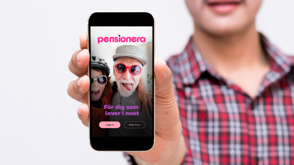
Pensionera

Figma DS

Pensionera Brand Guide

An external agency developed this Brand Guide a year before I joined Pensionera. For this design system project, I utilized several key elements from the Brand Guide that proved particularly valuable.

“We say it like it is and keep things simple”.

“We stand by what we recommend”.

“We always show compassion, encourage, motivate, and offer help”.

“We always show compassion, encourage, motivate, and offer help”.

Content Evaluation

My Starting Point

Useful keepers!

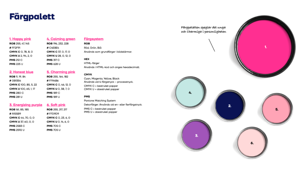
New Color Palette

Includes a wide range of colours, but their specific use cases have not yet been clearly defined.

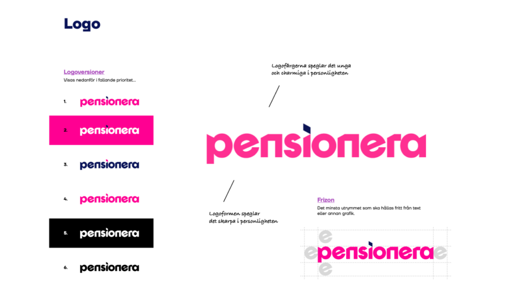
Pensionera Logo

Well-described way of use.

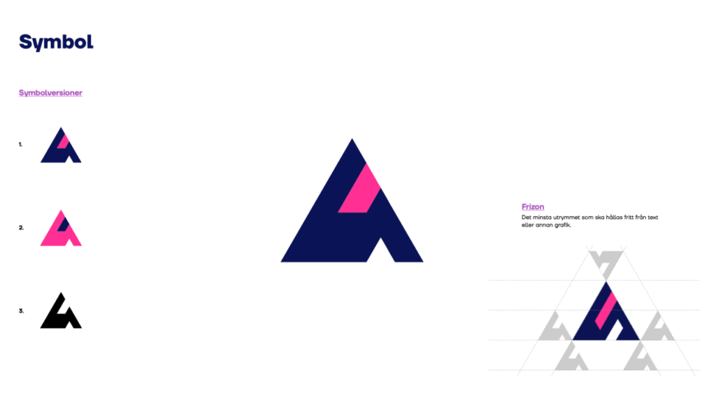
Pensionera Symbol

Missing clear examples.

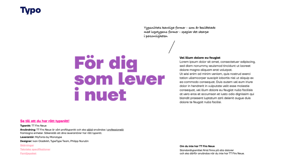
New Font

Missing clear examples.

Design System Core

Our design system is based on the principles of consistency, clarity, and user-centricity. It brings together standardized components, grids, and typography to create a cohesive experience that aligns with our brand identity.

Typography

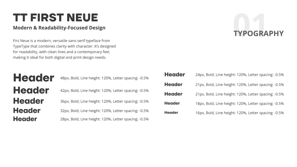
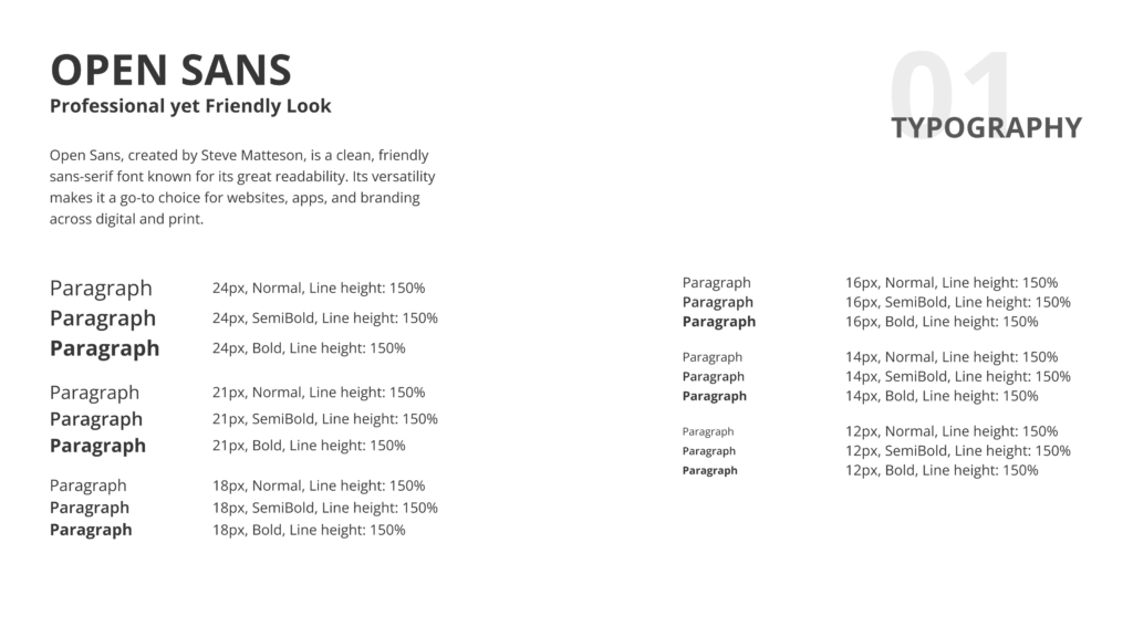
We use TT Firs Neue for headings to convey personality and Open Sans for body text to ensure better readability.

Grid & Layout

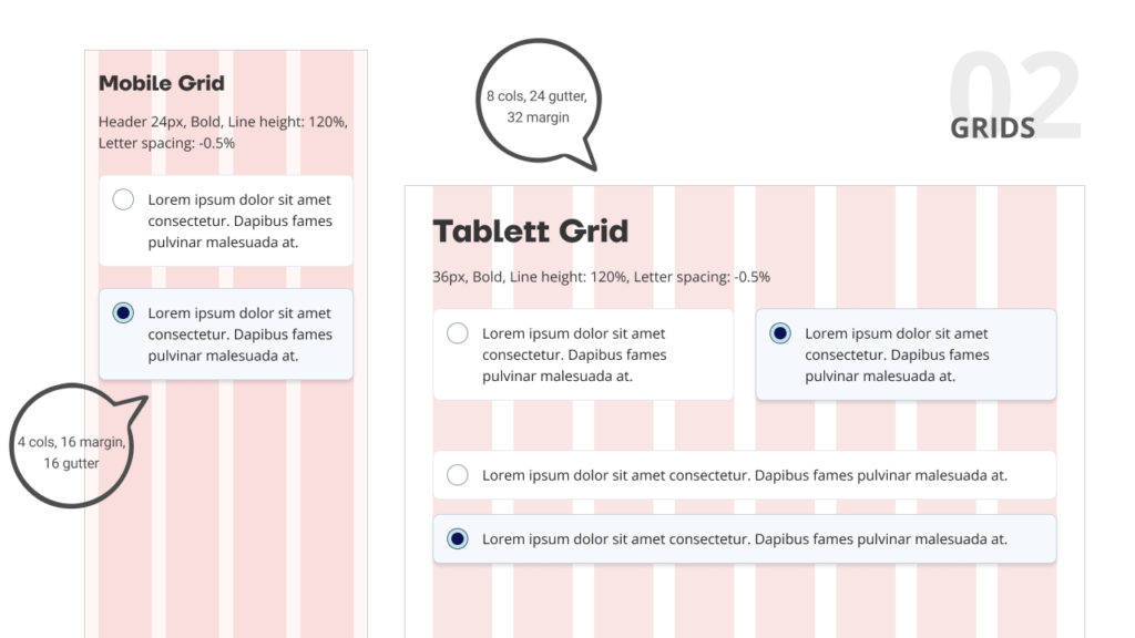
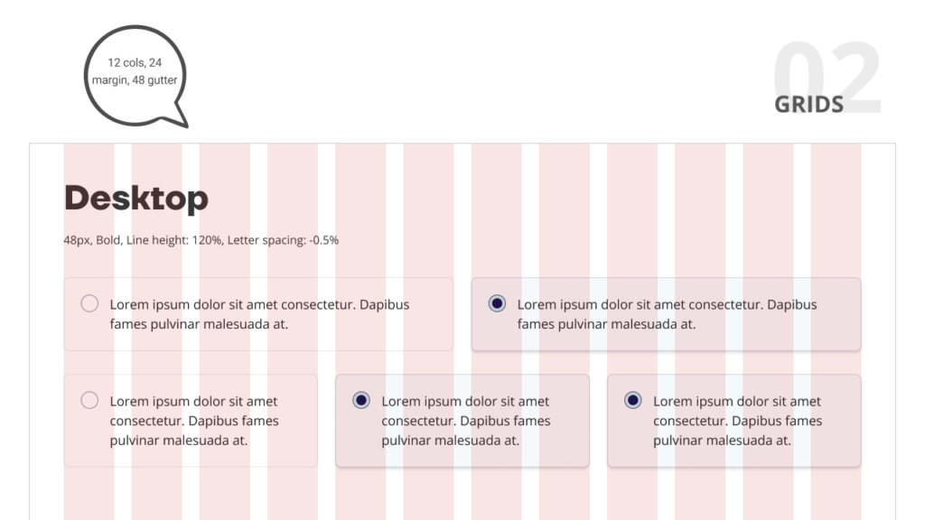
We use grids to create a consistent layout, ensuring alignment and visual balance across all screens.

Iconography

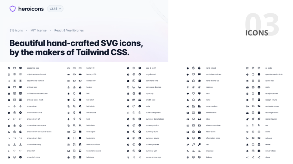
We use Open Source Hero Icons. They are simple, clean, and minimalistic line icons designed for modern user interfaces.

Colors & Style

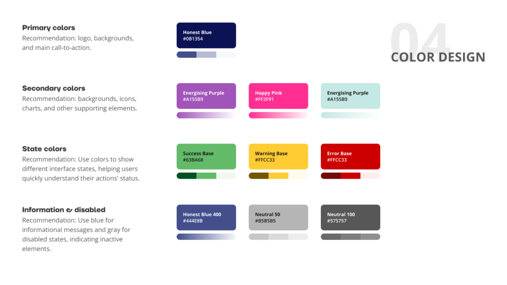
Color Palette

Colour schemes, primary and secondary colours, and their uses to establish brand identity.

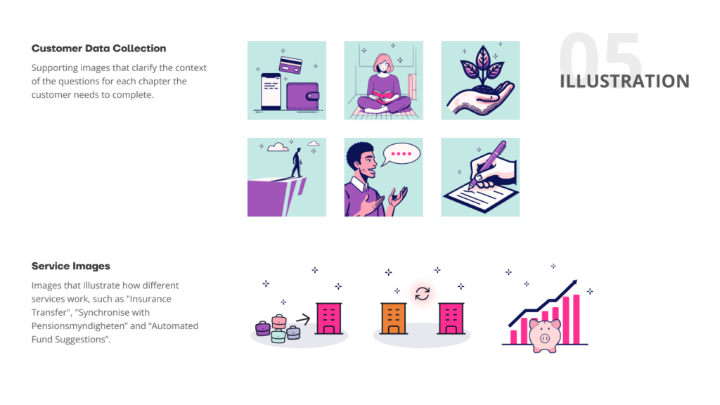
Imagery

Illustration styles, and image usage to maintain visual harmony.

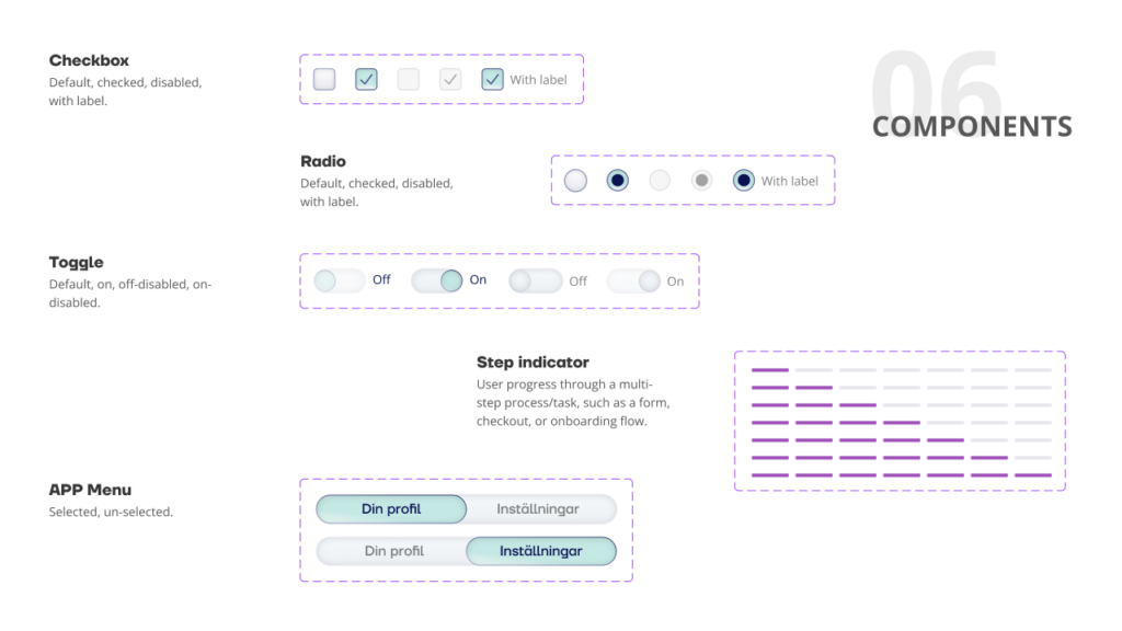
UI Components

Buttons, forms, navigation bars, and other reusable interface elements.

The Design System in Action

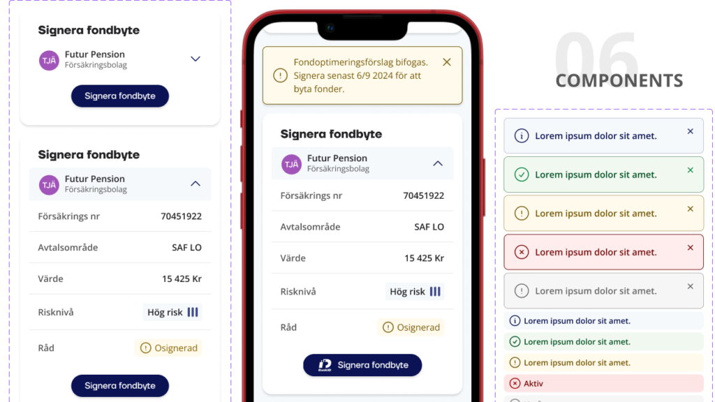
Building this system was a bit of a challenge since the style is very colourful and playful. With so many colours available, it’s easy to go overboard. The missing element here was colours for different types of messages, which I added to improve clarity and understanding.

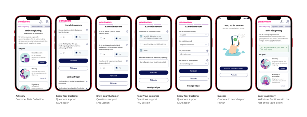
Chapter Based: customer information collection

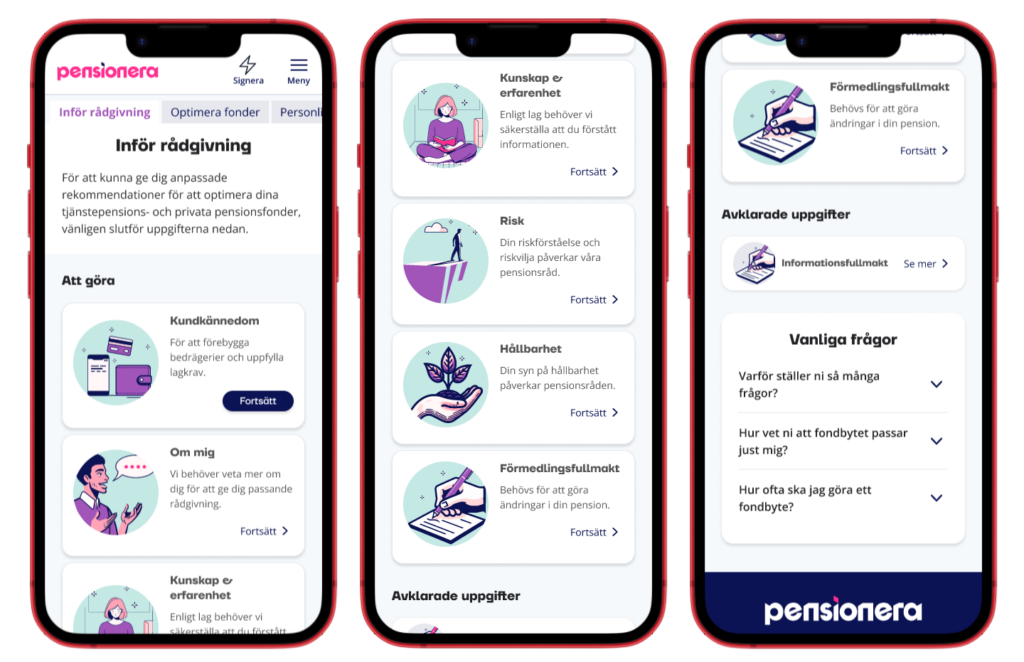
Clear Component Hierarchy

Spacious Design

Research

Pensionera Design Principles

Our design principles focus on clarity, simplicity, and the user experience. We make sure our designs are easy to understand and use, aligning with both customer needs and business goals. We also prioritize accessibility, ensuring our solutions work for everyone.

Chapter Based

Dividing content into logical chapters or modules helps users focus on one topic at a time. It also makes the structure predictable, which reduces cognitive load.

Progress Tracking

Showing progress through chapters motivates users and gives them a sense of achievement as they complete each chapter.

Limit Distractions

People can’t truly multitask; dividing attention reduces focus and quality. Effective design prioritizes one task at a time, keeping users engaged and present. This is why we moved the completed chapter to a new, smaller “done” section.

Avoid Jorgong

Focus on the customer, not the business. Avoid internal jargon or clever expressions; be clear, and kind, and use common terms.

Transparency & Trust

We focus on transparency to build customer trust by clearly explaining how their data is used and why it’s needed. Our designs avoid hidden elements or misleading interfaces, prioritizing clarity and honesty. Above all, we ensure business goals never outweigh customer trust.
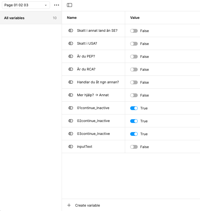
Prototyping with variables

I can use variables in Figma’s interactive components to dynamically adjust visual elements based on user input or interactions. For instance, I can change a button’s state or reveal additional fields depending on the user’s actions, as shown in the example below.

Trusted Excellence

Future & Maintenance

The design system is maintained by regularly checking for consistency in components, design tokens, typography, and colour schemes. Feedback from the team is collected to identify areas for improvement, ensuring new features align with existing principles. The documentation is updated to keep the system scalable, flexible, and user-friendly.

Design Tokens

We will implement design tokens (colours, typography, spacing, etc.) consistently applied across all components. This will help us maintain uniformity and make it easier to scale.

Plan for Scalability

As our product evolves, the design system must accommodate new components, patterns, and features. This requires structuring the system in a modular way to ensure easy updates and scalability.

User Feedback

We continuously gather feedback from designers, developers, and users who work with the system to identify pain points or areas for improvement.

Documentation & Wiki

We make sure to document user-friendly thoroughly and explain how to use each part of the design system. This should include clear examples of when and how to apply components, tokens, and patterns.

Scroll to Top