Designing a Pension Management Service

Background: Pensionera aimed to digitize pension management, making it accessible to everyone. Users could choose the free self-service option or upgrade to the paid version for advisor-led support. However, transitioning to a fully digital service presented challenges—users need to understand and trust a service before they’re willing to engage.

Business & customer

Challenges

The business aimed to reduce the time pension advisors spend on each client, particularly in gathering customer information—a process that currently slows down their work. By automating this, advisors could dedicate more time to offering tailored pension advice.
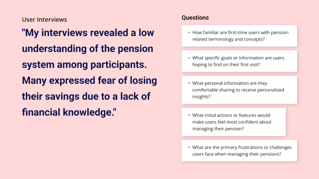
The main issue for customers was the lack of understanding of the pension system, which led to mistrust. The large amount of data felt impersonal and hard to navigate, making it difficult for customers to make confident decisions.

Business Needs

👉🏼 More efficient customer onboarding, would give advisors more time to focus on personalised pension advice.

Customer Needs

👉🏼 Trust & understanding to make informed decisions.

What I accomplished

🔥 Enhanced Sign-up

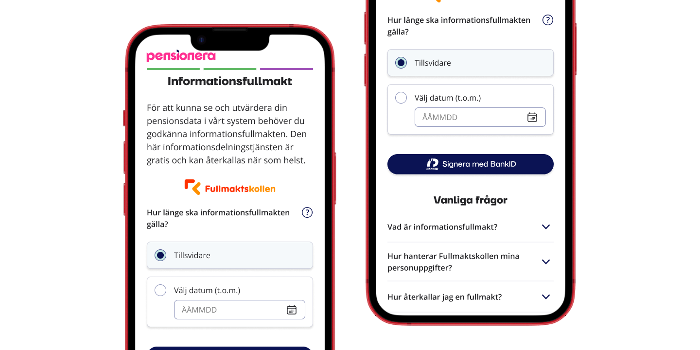
Fewer questions, help and assistance during the sign-up process.

🔥 Easier Onboarding

Using E-learning principles to guide users through clear, chapter-based customer data collection.

🔥 Data Restructure

Logically organized data enables users to understand & find information quickly.

🔥 Advisory Category

* Customer Data Collection
* Automated Fund Suggestion
* Personal Consultation

My Process

When it comes to pensions, both users and businesses face complex challenges. Users find pension decisions overwhelming, while companies must balance work efficiency, and legal requirements with user-friendly solutions. This case study shows how I transformed these constraints into opportunities.

My Role

UX Research
UX Copy
UI & Figma Design System
Work with legal requirements

My Team

CTO
2 Front-End Engineers
2 Back-End Engineers
Data Analyst

empathise

Customer Interviews & Field Studies

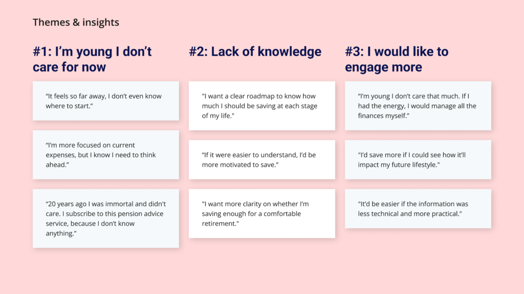
I interviewed individuals aged 25-50, the target demographic for this project, from various professions, including consulting, education, healthcare, construction, and engineering. I also attended customer advisory meetings to gain further insights and better understand their needs.

Stakeholder Interviews

I conducted interviews with key stakeholders to understand their needs, expectations, and challenges. These discussions offered valuable insights that informed the design strategy, ensuring the final solution aligned seamlessly with both user and business objectives.

To stay competitive and keep prices affordable, we need to improve efficiency and encourage customers to do more on their own.

Management

Since we work in advisory services, we must follow strict rules. It’s important to stay compliant to avoid penalties or losing our license.

Legal Department

Our job is to provide advice, which is what we’re paid for. Therefore, we want to avoid spending too much time filling in customer information.

Financial Advisors

Many customers struggle to fill in their information before the advisory meeting. Some sections are too complex, and they fear making mistakes, so they skip them.

Customer Service

CONTENT EVALUATION

My Starting Point

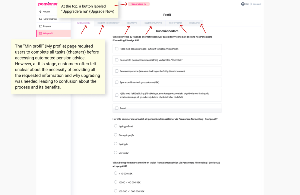
The system lacked guidance on what was expected from users and the purpose behind the onboarding. This left users uncertain about the process and why specific information was required. This gap in clarity added to user frustration and hindered engagement.

Define

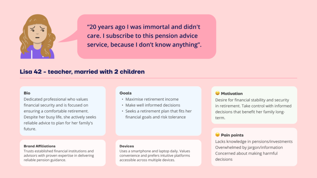
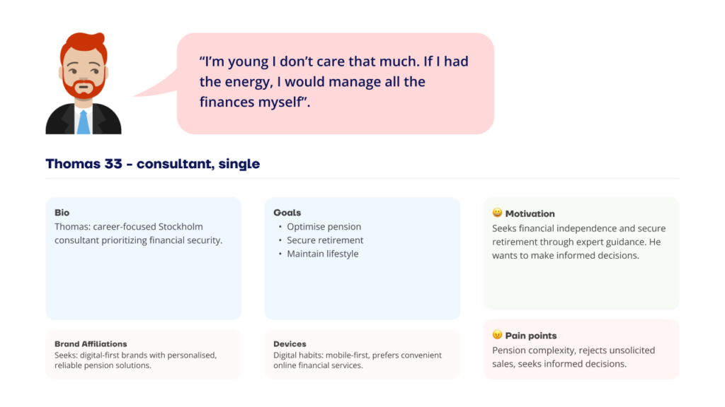
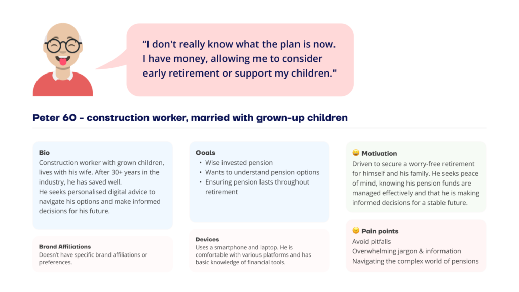
Main & Secondary Personas

In this project, we improved the experience for our younger persona, “Lisa,” motivated to enhance her pension situation despite challenges. Lisa aligns with Pensionera’s strategy to attract younger clients for long-term growth, representing a shift from typical near-retirement customers.
Prioritizing Lisa’s needs while considering secondary personas, we designed solutions that reduced the average user age, fostering lasting engagement and aligning with company goals.

👉🏼 Lisa 42, our main persona

We prioritised solutions that centre on “Lisa” while supporting secondary personas.

LEARNING & INSPIRATION

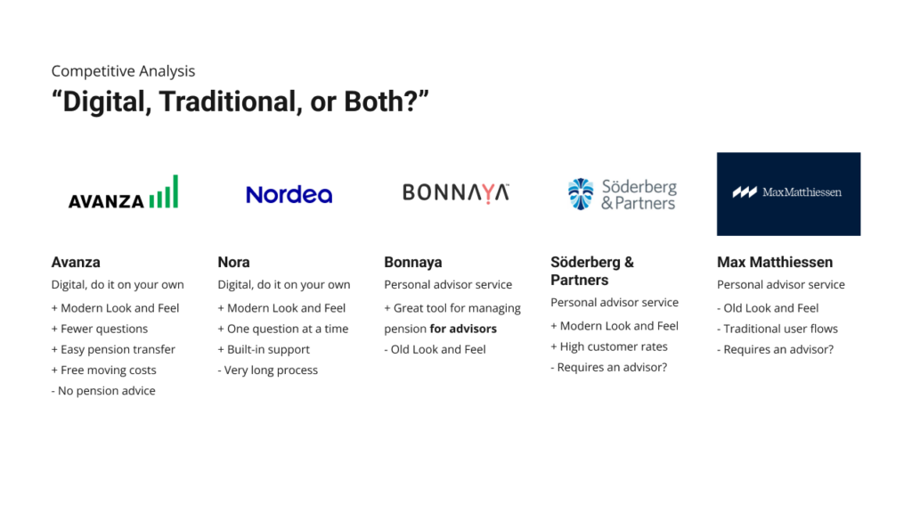
Competitive Analysis

I gained valuable insights from studying various services, examining more than what I’ve presented here. Some services operated under different legal frameworks, allowing them to ask customers fewer questions since they didn’t provide advice.

Other companies I researched: SEB, Nordnet, SAVR and more.

IDEATION

Exploring Legal Requirements

Several brainstorming sessions were conducted with all stakeholders, particularly the legal team, to explore ways to simplify the sign-up process and clarify the onboarding experience for customers.

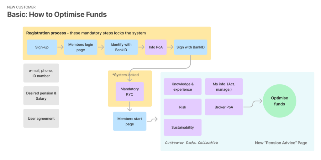
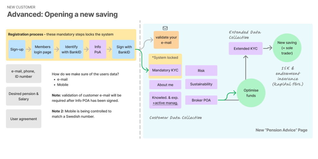
Sign-up

Do we need to ask so many questions? What is nice to have, and what is required by law?

Data Restructure

The customer data collection, necessary for both automated fund suggestions and personal consultations, was moved to the Pension Advisory section. This streamlined approach allows users to easily provide the required information for any advice, ensuring a smoother and more organized experience.

Customer Onboarding

Numerous legal considerations could lock the system, such as not answering certain questions or if an answer became outdated and needed updating. The key question was: what is the logical mapping and order, both for the customer and for the business? Additionally, what questions are irrelevant for most customers, so we can create a separate set of questions for those customers only?

Brainstorming: User Flows
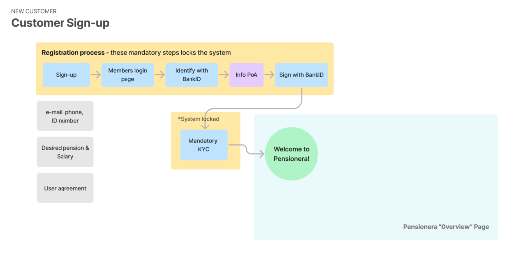
LO-FI SKETCHES

Customer Onboarding

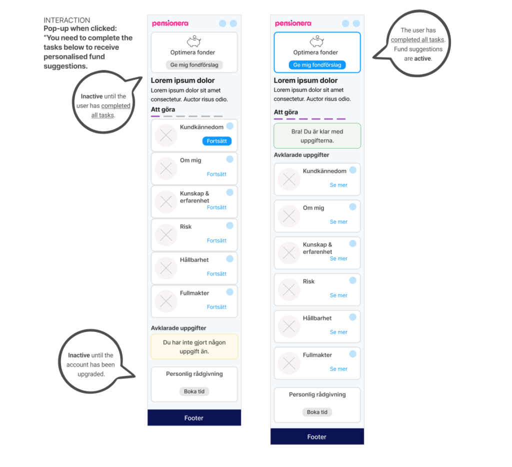
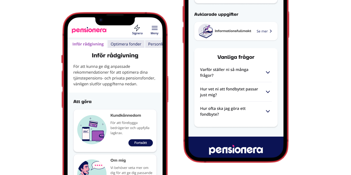
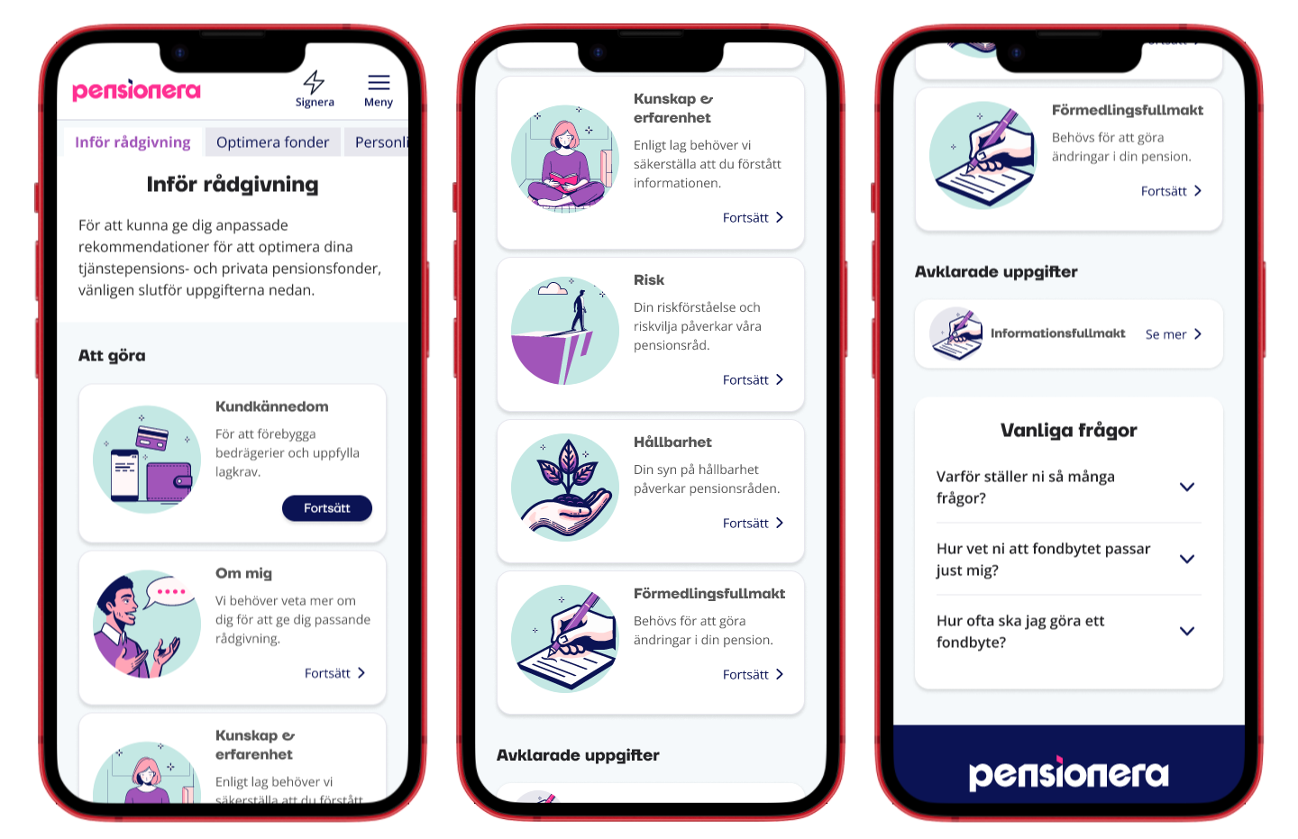
E-learning principles simplify the user experience. Completing chapters unlocks the “Automated Fund Suggestion” feature, and finished chapters move to the “completed section”. Users receive feedback when they finish all chapters or if none are completed, encouraging progress.

Iteration #1: I grouped all elements related to “Automated Fund Suggestion” and “Personal Consulting” since these were the company’s priorities.
However, I realized there was still too much information for the customer to process. I needed to rethink and streamline what tasks a customer could do and clearly explain why completing them was important.

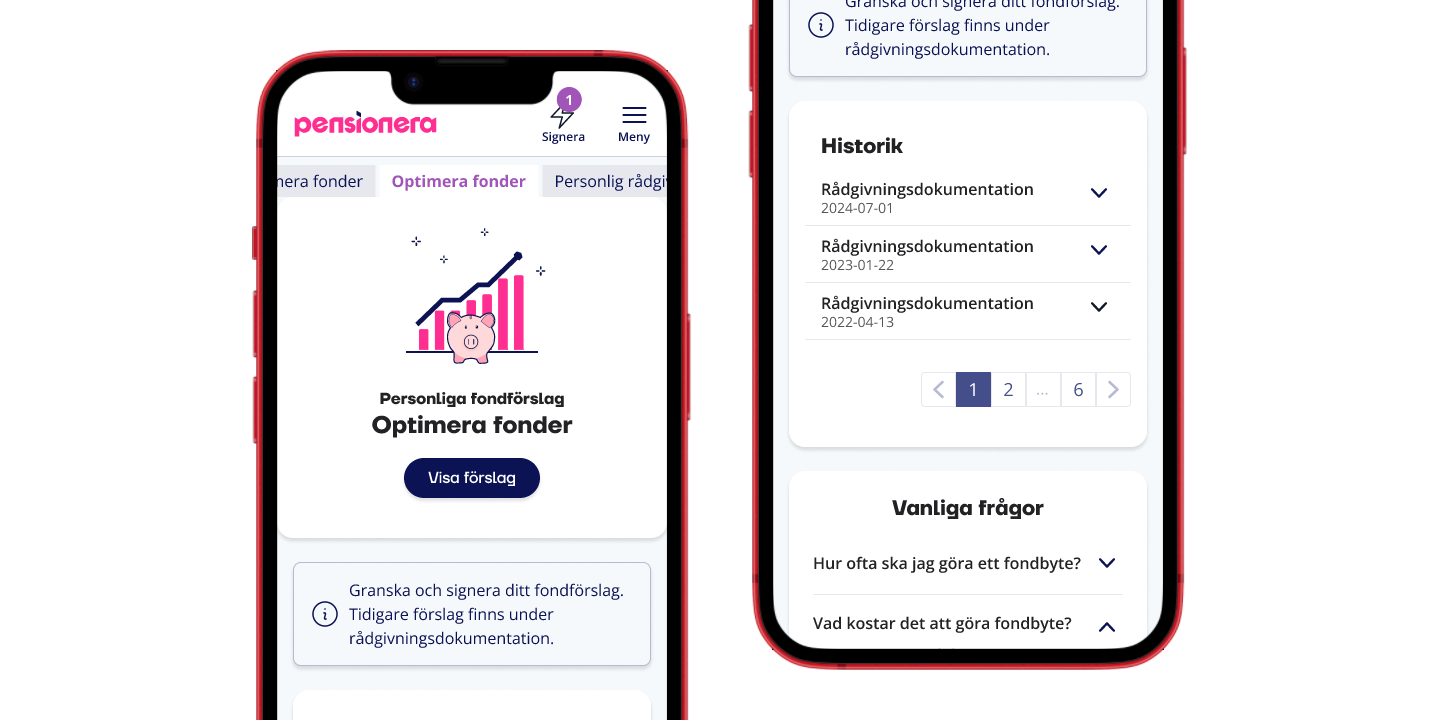
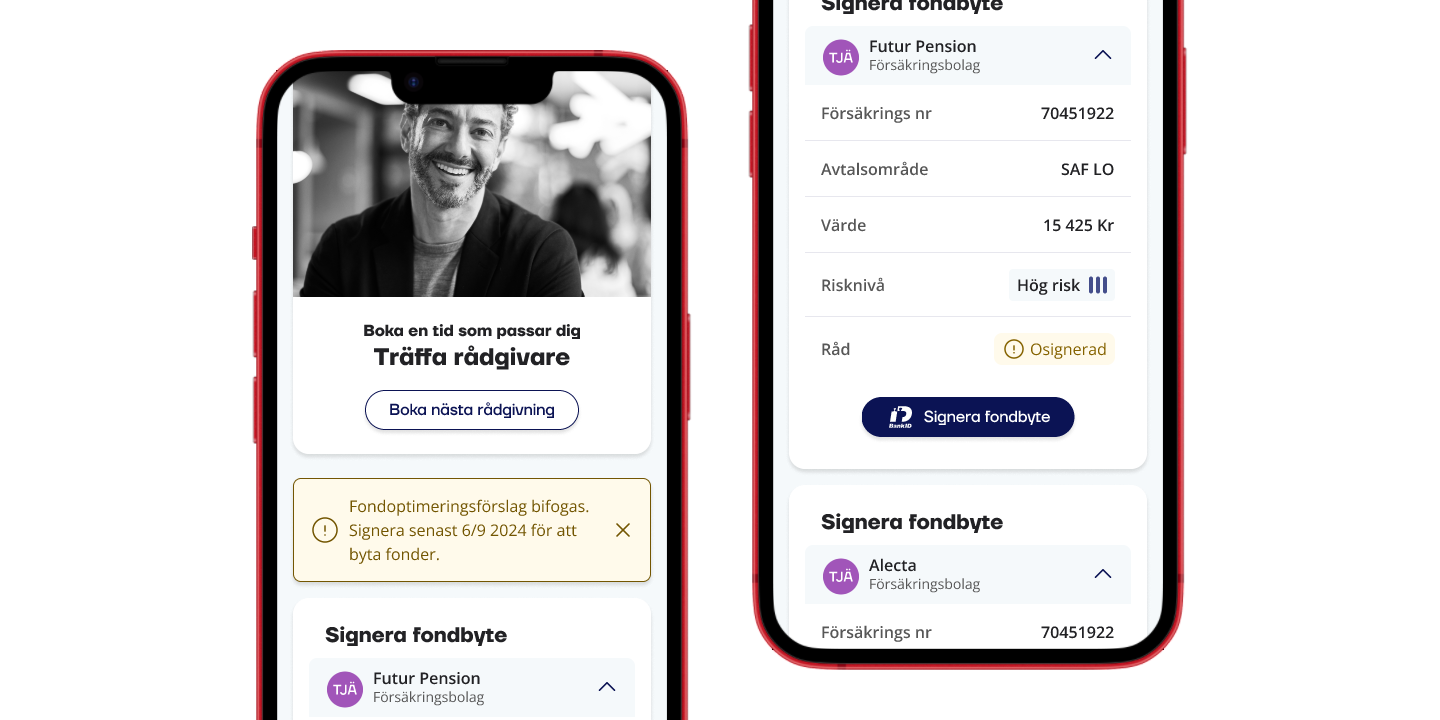
Iteration #2: I simplified and removed everything unrelated to gathering customer information and moved “Automated Fund Suggestion” and “Personal Consultation” to separate pages in this version. This made it possible to centralize all elements specific to each advisory service, such as signing proposals and accessing history, which had previously been scattered across various locations.
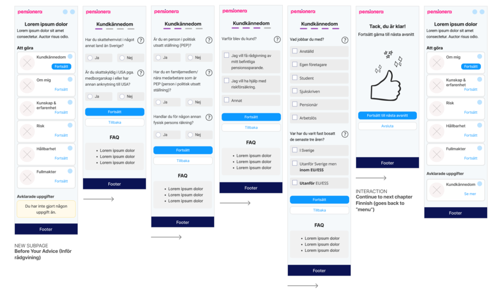
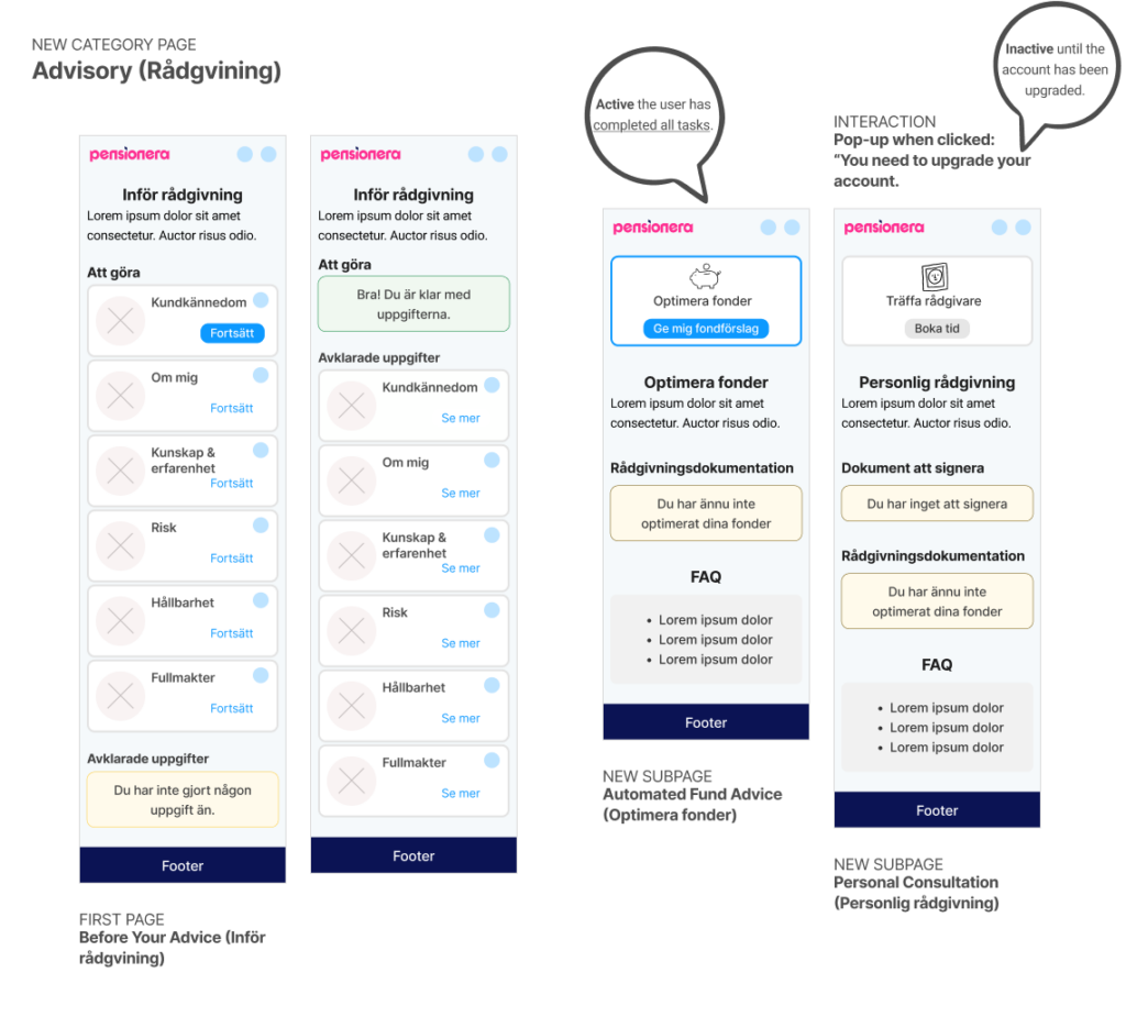
HI-FI SKETCHES

Prototype

I created a Figma prototype to make customer data collection simpler and show why it’s needed. It clearly explains our services, like automated fund suggestions and personal consultations, in a user-friendly way. The design organizes scattered features into clear sections, helping users complete tasks easily and see the value in providing their information.

New Advisory Category

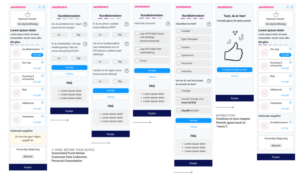
Chapter-based Customer Data Collection

New: Automated Fund Suggestion & Personal Consultation


View the Prototypes

1. This section highlights the “Before Consultation” phase, illustrating how customer data collection is structured and functions.

2. This section demonstrates how the Know Your Customer (KYC) process operates, providing a clear view of its workflow and functionality.
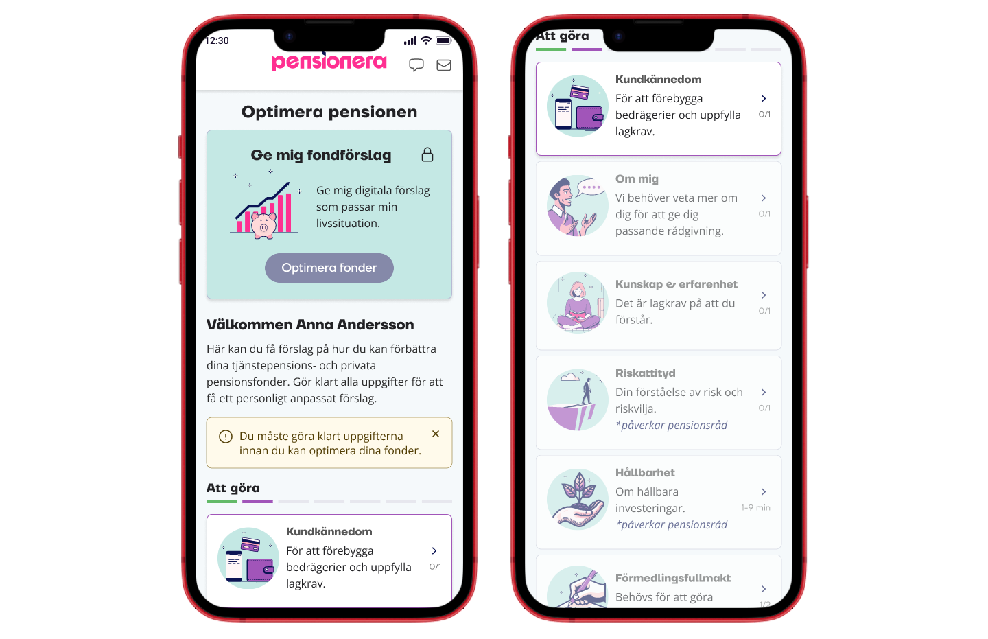
TESTING HYPOTHESIS

User Testing

I conducted user testing to evaluate the new design, focusing on the customer data collection process. Participants provided feedback on usability, highlighting areas of confusion. Insights gathered helped refine the design, ensuring it aligns with user needs and business goals for a more intuitive experience.

FIRST ITERATION

Optimise Pension

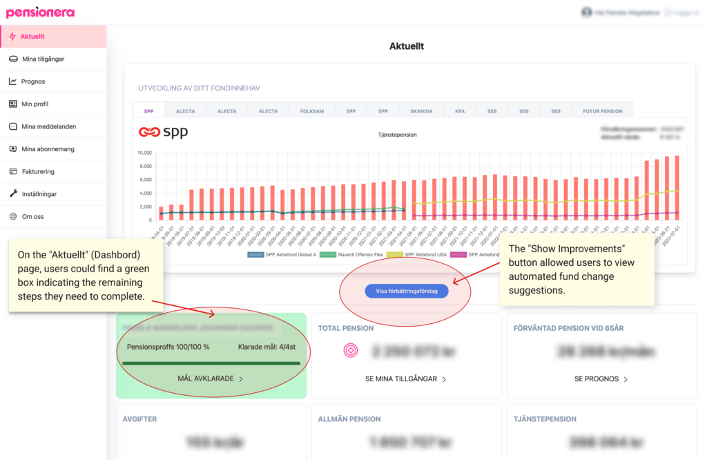
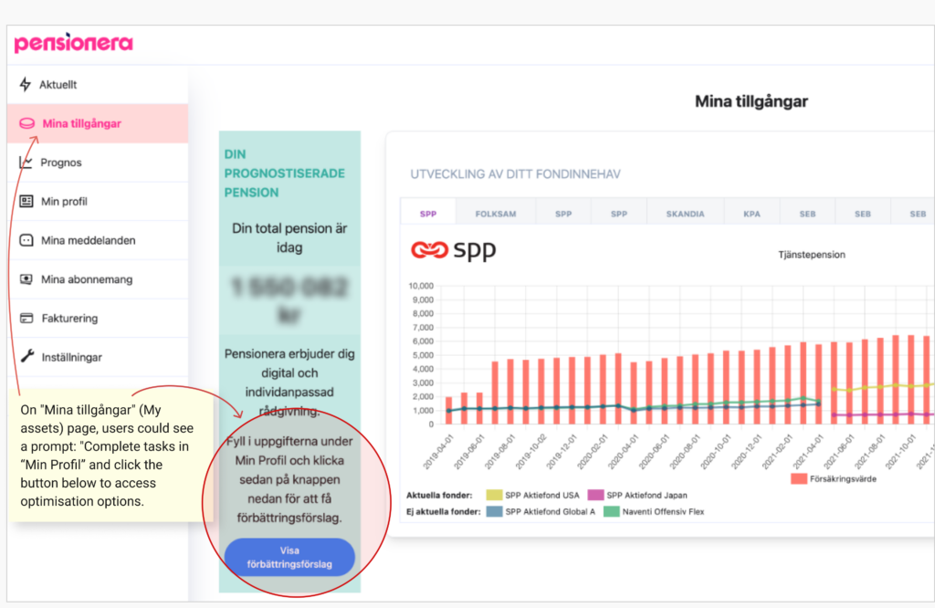
The first iteration focused on the main goal of providing Automated Fund Suggestions. The feature “Optimize funds” was placed at the top of the page, alongside the required customer data collection sections. This feature remained inactive until all necessary chapters were completed. If users attempted to access it before completing the data collection, a message prompted them to finish the required sections first.

Learnings

New Category: Optimise Funds

Customers mistakenly thought their pension would automatically improve by clicking the menu “Optimise Pension”, which caused discomfort and anxiety.

Information Overload

Customers felt overwhelmed by the information presented and still desired clearer explanations about what was expected from them and why.

Continue to the next chapter

Customer service suggested changing the main CTA button to continue to the next chapter so customers would complete data collection faster.

This is still too complicated

The live version had all questions grouped by topic and displayed on one long page. We broke this down into smaller sections to make it easier for users to understand.

SECOND ITERATION

Advisory

I added an introduction text and moved the Automated and Personal advisory sections to separate pages, allowing users to focus solely on completing the chapters. I renamed this part of the system to “Advisory” (Rådgivning) for clarity. The page now carries the title “Pre-Consultation Steps” (Inför rådgivning), similar to our competitor Bonnaya.

Learnings

New “Advisory” menu

The new category name felt natural and didn’t cause any more issues.

Customers avoid scrolling

In some cases, customers had difficulties finding help and support, because some explanations were at the bottom (FAQ sections).

My pension advice

Users wanted clarity on which chapters directly impact their pension advice.

These chapters are too difficult

The “Knowledge and Experience” and “Sustainability” chapters are challenging, causing anxiety and uncertainty, which leads to hesitation in completing them.

Final words

Conclusion

This UX/UI project aimed to enhance the customer experience by streamlining customer data collection, simplifying complex processes, and offering clear guidance for Automated and Personal Consultation services. Through thorough user research, iterative design, and testing, I delivered a solution that minimizes user confusion and anxiety, ensures compliance and aligns with business objectives.
While some chapters still need improvements to enhance clarity, engagement, and accessibility, addressing these will create a more seamless and intuitive experience for users while achieving company goals effectively.

More Innovative Ideas

Guided Conversations

Introducing a video bot that can ask questions one at a time, breaking down complex sections into manageable pieces while explaining why specific information is needed.

Personalized Assistance

If users struggle with certain questions, the video bot can provide tailored examples or rephrase the questions for better understanding.

Real-Time Validation

A video bot can verify responses as they’re provided, alerting users to errors or incomplete fields immediately to prevent confusion later.

Inclusive Design

A voice-enabled video bot can cater to users with reading difficulties or other accessibility needs, ensuring inclusivity.

Chapter Summary

Since this process seems straightforward, a summary view displaying chapters in sequence would be beneficial. It would provide a clear overview of completed sections and what remains, enhancing transparency and progress tracking. I believe this intuitive approach will make the experience more engaging and satisfying for users.

Scroll to Top